A Parade of Princess Peach Prototypes
The prettiest pink princess in video games did not always look how she looks today, it turns out. She wasn’t even always pink.
In doing research for the previous post on how the Goomba might have gotten its name from a language that’s not Italian, I found an early design for Princess Peach that I had not seen before. While I included that in the post, the research ended up taking me to a cache of even more preliminary designs for Peach. And I figured if they were new to me, a guy who has been heavily invested in the Super Mario games since the earliest days on the NES, then maybe some of you all would be surprised by these alternate Peaches that could have been and maybe almost were.
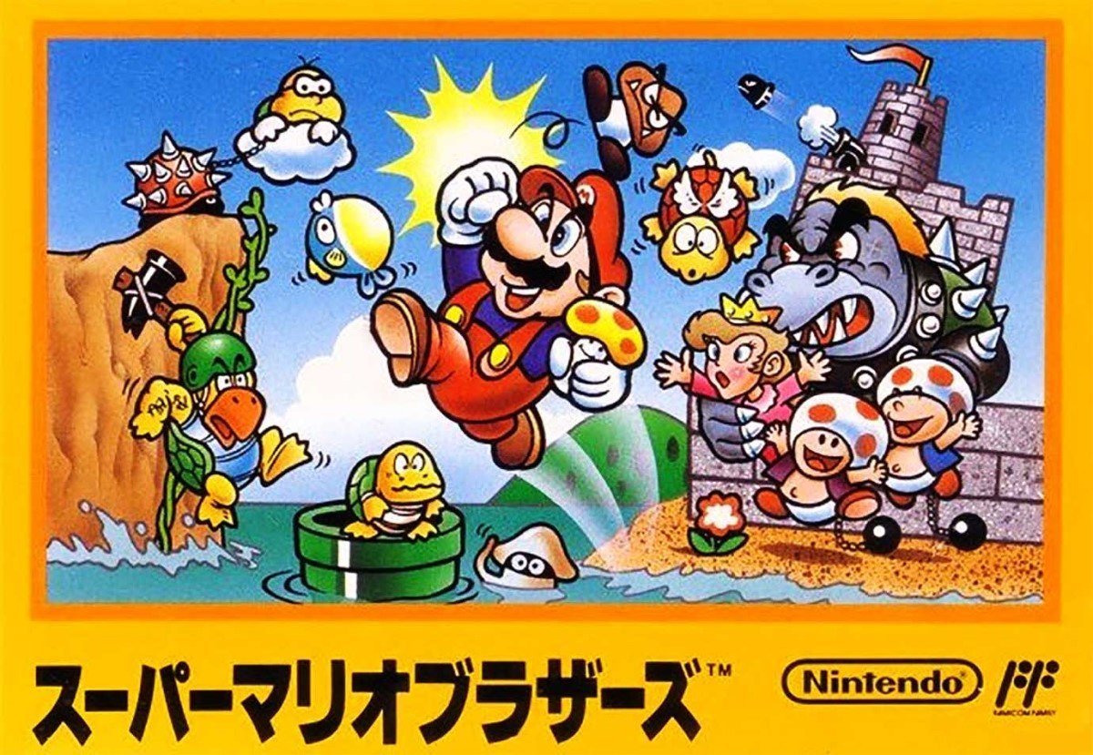
To recap my post on elements from Super Mario Bros. 2 that would become series canon, there was a major evolution in the design of Peach from the Japanese box art for the original Super Mario Bros. to how she looked in the sequel. Maybe it’s just a result of the way she’s posed in the SMB illustration, but this earliest version of her seems smaller and younger, and it looks like she’s wearing a simpler dress. She looks like a kid, basically.
Japanese box art for the original Super Mario Bros., featuring a proto-Peach who looks like she’s wearing jammies.
That version of Peach was actually drawn by Shigeru Miyamoto himself, as noted in a 2012 edition of Iwata Asks in which Yōichi Kotabe, longtime illustrator for the Super Mario games, discusses refining the original design into something that more closely approximates how Peach looks today.
Miyamoto: Peach completely changed. I told him everything I wanted, like how I wanted the eyes to be a little cat-like.
Kotabe: And how she should look stubborn.
Miyamoto: Stubborn, but charming. (laughs)
The allegedly cat-eyed Peach, via Iwata Asks. I guess you’d have to be a little stubborn in the face of constant attacks from the Koopa Kingdom.
I am not sure I’ve ever been able to see how her eyes are cat-like, but at the very least I imagine that the longevity of the Cat Peach version of the character stems from the fact that some feline quality was baked into her almost from the start. Kotabe’s take on Peach debuted in the box art for Super Mario Bros. 2, a.k.a. The Lost Levels, and as you can see, it’s a lot closer to the current design in terms of her scale, her clothes and her coloring. In fact, the only design feature that seems to carry over from the SMB design is the odd rosy cheeks that sort of look like she’s suffering from a breakout. I’m fairly sure this design element is meant to convey something else, but whatever it is, I’m not sure I’ve seen it in other illustrations. Do tell me if you know.
From a flyer for the Japanese Super Mario Bros. 2 (The Lost Levels).
The Lost Levels first came out in June 1986. The western version of Super Mario Bros. 2 was first released in October 1988, and at this point Peach had a look that was further defined version of the one she sported in the Lost Levels illustration — minus the odd cheeks.
From the instruction manual for the western Super Mario Bros. 2.
Peach has looked the same, more or less, ever since. She got a sundress and an updo for Super Mario Sunshine. Occasionally she’ll sport something other than a skirt for athletic purposes. And she got a whole wardrobe of alternate costumes for Super Mario Odyssey — all cute as hell, if I do say so. But in the past forty years, Peach’s default look hasn’t changed hardly at all, save for a few enhanced details permitted by the advancement of graphics technology. And this is notable, because that’s not the case for the other women in the Super Mario universe; Daisy, Pauline and Syrup have each gotten significant redesigns since their introductions.
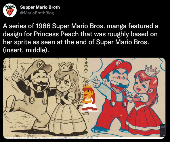
This iconic look was not always the one, however, and some very different conceptions of Princess Peach existed early on — some even making it into Nintendo-sanctioned materials. In April 2022, for example, manga artist Gaku Miyao posted to Twitter to explain that before Nintendo standardized the design for Peach, he worked on some Nintendo merch for girls that featured his own take on what she might look like beyond mere pixels.
It’s a very charming design, though he notes that a lot of Mario fans see it and presume it’s not a genuine Nintendo product because Peach looks so very different.
In the Goomba etymology post, I posted a depiction of Peach from a Japanese storybook tie-in where she has a blond bob that I suspect was chosen to give her a vague mushroom shape. Given her status as the princess of the Mushroom Kingdom, it has always seemed strange that her design features no real tie to her mushroom-headed subjects, and I suspect that the artist who did this book was trying to account for that somewhat.
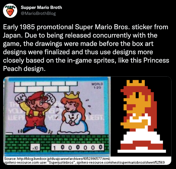
I will also point out that there are some remarkable similarities between these two designs — the one from the shoes and the one from this storybook. Both give Peach a pink and red dress, which is notable because in her original sprite, she’s wearing a white dress with red trim. I would imagine that either design could have resulted from an artist trying to find a middle ground between that in-game sprite and the pink jammies version in the SMB box art. However, the similarity between the designs makes me think that these two designs could have been working off some sort of Nintendo-supplied source art, if one wasn’t just riffing on the other. Both designs give her white cuffs, a white collar and similar enough crown designs, in addition to giving her a red dress with a pink element that various fashion-minded people have identified as a bustle, a peplum or panniers, depending on how this two-dimensional, Sleeping Beauty-style garment would work in real life.
Keep in mind that the original Super Mario Bros. sprite for Peach left a lot of room for interpretation, in that she’s a horrible pixel monster who is just begging for a redesign.
“BLAARGH! I am the princess of blocks, I have the color scheme of pizza and I want to kiss you with my misshapen mowf!”
It’s actually something that was commented on back in the day, including in this comic appearing in the fourth issue of the Japanese gaming magazine Famicom Top.
Unclear on the context, exactly, because this is just one panel of the comic, but my translator is giving me this text as Mario saying, “Let’s see here... It’s said the reason you won is because of ‘thousands of thousands of Mario’s lives were sacrificed for this piece of shit!’ Could we get a word?” And then Ugly Peach responding, “I’m gonna rip your balls off.” Yes, that is what my translator sent me. Am I being punked? Image via the blog Famicom Story.
In fact, in some cases that original design with the red and white dress was adapted rather directly.
Via.
Via.
Via.
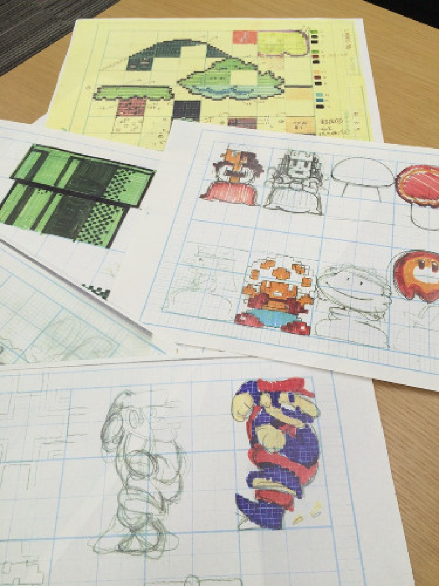
That’s why I was very surprised to learn that this was actually a revision from an earlier idea for an in-game sprite for Peach. It seems like the source for this image, an early SMB design document, goes back to a 2015 article that ran in the Japanese newspaper Asahi Shimbun, although the page seems either to have been moved or taken down. Gaming Alexandria’s Ethan Johnson has preserved the images here, however. One of them shows a drastically different take on Peach — in two poses, one facing forward, one with her head turned to the side, like a hieroglyphic. It’s not all that much closer to her concept art, and honestly the face is even worse, looking more like a flesh-colored Shy Guy, her large eyes offering only a void where you’d expect emotion.
The Japanese blog Famicom Story is actually the place where I first encountered this image, where the author used this suggestion of what the sprite would have looked like to create a pixel art version of it.
I remade these pixel-by-pixel, but they’re essentially the same as the ones over at the Famicom Story post. I just subbed out the red that person used for a pink, since it looked like the concept art might be going for more than a pink.
The Famicom Story author here also goes on to explain why the coloring ultimately changed. Sprites on Famicom/NES hardware could only be comprised of three colors, with a fourth being the “transparent” background color, and this mock-up used five: yellow for skin, brown for hair, pink for the dress and white for the sleeves and crown, in addition to “transparent” black. The redheaded sprite that appeared in SMB seems like an artist’s best attempt at rendering a regal-looking woman with essentially only three colors to work with, though perhaps the that initial design might have been available to artists trying to adapt Mario for merch, in the sense of “Here, this is what we were actually going for.” The limited color options for skin tone also explain why Nintendo ultimately gave Peach red hair when they’d intended her to have brownish-blondish hair. Indeed, that sprite concept art sheet also offers a more complex color scheme for Toad as well as a red and blue take on Mario that more closely matches the character art he had in Donkey Kong and Mario Bros.
Famicom Story also points out all ways the SMB sprite for Peach works better than this rough draft version, noting that there are good reasons why certain facial features are exaggerated:
More specifically, the pixels used to draw Princess Peach’s mouth [in the finalized version] are meant to express “the joy of being saved by Mario.” Her protruding chin indeed tends to attract attention, but that is only because she has a large mouth. It’s not her chin that is jutting out, but that her mouth is open wide in a big smile. Strangely enough, the shape of her mouth even makes her eyes look like they’re smiling… The difference is obvious when compared to the original Princess Peach. They all seem to be “expressionless,” while the final version of Princess Peach has a rich variety of facial expressions!
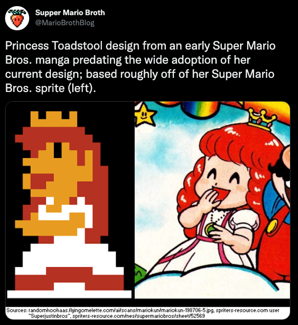
Before the design was finalized, alternate takes on Princess Peach abounded. Of particular note is the Japanese game guide How to Win at Super Mario Bros., published in Japan in 1985 and the U.S. in 1987, which features original designs by artist Daisuke Shigoto of a damsel in distress who truly is the embodiment of the character’s western name, Princess Toadstool, even if she wasn’t known as that in that region. She looks every bit the part of a mushroom princess, with a color scheme wholly different than she’d ever been depicted otherwise and, oddly, a mushroom cap with a white-on-pink color scheme that wouldn’t be seen in a Mario game until the introduction of Toadette.
Finally, there is an especially mysterious proto-Peach that appeared in a circa 1992 episode of the French economics news series Capital, in an episode profiling various Japanese game companies. The segment begins at Nintendo’s Japanese headquarters, and while explaining the history of Mario the screen briefly flashes with a pencil drawing that appears to be some kind of riff on the SMB box art, drawn either before or after.
This is a color-corrected screengrab from the news segment. In this video, you can see it at the 4:11 mark. I’ve no clue who the old man in the bottom lefthand corder is supposed to be, though I’d guess he’s the often-suggested, never-shown-in-game Mushroom King.
While Mario looks fairly spot-on, Bowser doesn’t and Peach is *way* off, with some sort of mushroom-style Miss Muffet hat instead of a crown and Shirley Temple-style ringlets falling beneath it. I have no idea who designed this art, though the fact that it looks vaguely enough like the finalized SMB box art makes me wonder if perhaps Miyamoto drew this one as well.
I do wonder if the people designing all these early versions of Princess Peach had any idea they were helping shape what would become one of the most popular female video game characters ever. But it’s the fact that she is iconic that makes it fun to look back at all these weird versions of her. Maybe she wouldn’t have endured if Nintendo had selected something else for her standardized look. Maybe Nintendo would have swapped her out early on, like they did with Pauline. Or maybe there’s nothing inherently iconic about the way Peach looks, and it’s just proximity to Mario that has made her popular by proxy.
Whatever the case, if you come across any interesting Peach prototypes like the ones in this post, let me know and I’ll happily add them in.
Miscellaneous Notes
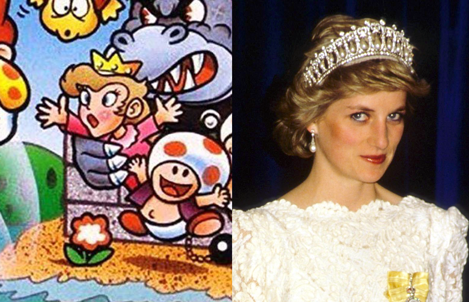
The blogger at Famicom Story theorizes that Peach’s trademark high-volume hair could be a riff on Princess Diana, who would have been at the height of her popularity in 1985 and also a real-life royal. I can see it, though I have to admit that when I look at Princess Peach’s hair flips, I see Farrah Fawcett’s iconic ’70s hairdo, just rendered in the two-dimensional, cartoony style that Mario characters were and often still are drawn in.
I can’t find any quotes from anyone involved in the creation of Peach that would tie her to any one celebrity, though there certainly is a history of Japanese video game companies incorporating real-life people into games and then not saying so. All that said, I’m now more tempted to think that Peach’s hair is meant to evoke Princess Di, even if she didn’t ever grow her hair that long during her public life. The “Princess Mushroomhead” take on Peach is especially reminiscent of Princess Di, right down to being colored a more realistic shade of blond, as opposed to Peach’s cartoony banana yellow color.
The Peach sprite designed for The Lost Levels is a vast improvement over the original one, even if it’s nowhere near the concept art. It also looks like a more artfully realized version of the one glimpsed in those design docs, especially down to the way she’s clasping her hands together. Excuse my ignorance about technical limitations, but it’s too bad they didn’t just opt to give her a pink dress. Had they done so, it would have been even closer to the concept art, although I suppose the pink dress and red hair combo would have been a bit much?
Peach’s Lost Levels sprite, alongside what she’d look like in pink.
Peach, for the record, did not appear in-game with blond hair and a pink dress until she entered the 16-bit era with Super Mario Worl.d So should I do a piece on the cosmetic evolution of Daisy, Pauline and Syrup? Yes, I think I should.
Finally, the Famicom Story blog post has a section discussing the peculiar phenomenon of how back in the day, onscreen characters frequently looked nothing like they did in their concept art. Peach was not alone in this regard. I thought this was interesting had wanted to translate a few paragraphs.
Let’s take Lucia from The Wing of Madoola for example. For the first time in their life, my friend in elementary school bought the game because of the cover art. But in reality, Lucia’s pixel art in-game looked like the picture below.
If you were to tell a person who didn’t know any better that these were the same character, they’d surely double-check the date on the calendar to make sure it wasn’t April 1.
The most striking example of this is Valkyrie, the protagonist of The Adventures of Valkyrie. The cover art on the package shows her in gallant armor with braided blonde hair, but her pixel art depicts her as a stocky, black-haired figure.
According to Bandai Namco Studio’s official Youtube channel, the reason for this is that, “The priority was given to specifications such as color changes of characters based on player settings." However, according to Hiroshi Fuji, the character designer for The Legend of Valkyrie: The Adventures of Rosa fan book, he drew the character illustrations after seeing the pixel art that had already been completed.
Why would Fuji go out of his way to draw characters that look completely different? I suppose all we can say is, “Because that was the norm back then.” So, as we’ve established, many game characters didn’t really have official designs and it was often left to the player’s imagination. Because of this, it doesn’t come as a surprise that he imagined Valkyrie as a beautiful girl with braided blonde hair.
At the time, none of the manufacturers, Nintendo, nor wholesalers saw the discrepancy between the character illustrations and the pixel art as a problem. The circulation of the software in question is proof itself.
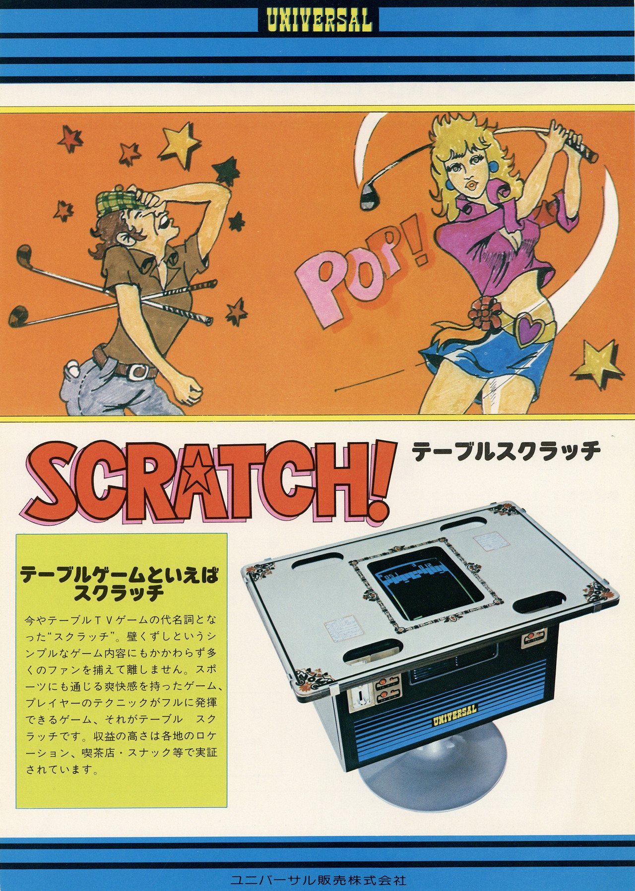
EDIT: After this post went up on Twitter, Kate Willaert directed me to a discovery she made in September 2021: a flyer for the Universal arcade game Scratch, featuring a female character who looks astonishingly like Princess Peach… despite the fact that this document came from 1977.
I’m at a loss for what to make of it. It’s possible it’s a coincidence. It’s also possible this obscure drawing might have influenced where Nintendo would take its design for Peach, I suppose, but what I’m curious about most is whether both Peach and this lookalike might both be riffing on a common inspiration that I just haven’t identified yet. Anyone?
EDIT: September 2, 2024: A reader reached out on Twitter to point out that Heather Thomas in the 1982 movie Zapped! shows up dressed remarkably like Princess Peach. I can see it. The particular shade of pink, the crown, the jewels on the crown the evening gloves, the hair color and style all evoke Peach — years before Peach existed.
Oddly enough, this is an actress I had just recently looked up because she starred on the original TV series The Fall Guy, which was remade earlier this summer as a movie with Ryan Gosling. Thomas reprised her role for a cameo in the remake.


